
Prepare Photos for an AI Invitation Maker
Why photo prep matters before you generate an invite
A strong invitation photo does more than look nice. It gives the design direction, sets the mood, and helps the first draft feel closer to the event from the start.
That matters even more when the tool lets users upload a photo as part of the generation flow. A clear image, a focused subject, and the right file type can save time that would otherwise be spent regenerating the same idea.
A prepared photo also makes an AI invitation generator easier to steer. Instead of hoping the image will carry the whole design, users can pair a better upload with a clearer event description, invitation type, and ratio choice.
Choose the right photo before you upload anything
The first decision is not editing. It is selection. The best starting image is usually the one that already matches the event mood and has one clear visual priority.
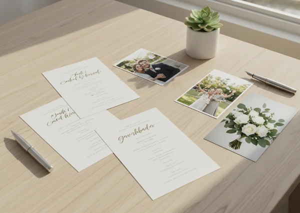
Portraits, product shots, and event photos need different crops
Portraits usually work best when the subject is easy to place and not crowded by distracting background details. Event photos need enough space for context, but not so much clutter that the invitation loses its main focus.
This is why it helps to decide what the photo is doing before uploading it. Is it introducing a couple, showing a child, highlighting a baby shower theme, or bringing a brand element into a business invitation? One job is better than three jobs.
A simple rule helps here: aim for 1 clear focal point, or at most 2 closely connected subjects. That makes later text placement easier and keeps the final draft from feeling busy.
What to remove from the frame first
Before upload, remove anything that competes with the invitation message. Crooked backgrounds, random objects, hard shadows, and visual noise all make the design feel less intentional.
It also helps to remove old screenshots, stickers, or text already baked into the photo. Invitation text should feel built into the new design, not layered over leftovers from another image.
Pick an image format that matches the design goal
Not every image file solves the same problem. The fastest way to improve results is to match the format to the role the image will play.
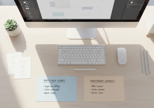
When JPEG usually works best
MDN's image type guide says JPEG is a lossy format that usually works best for complex still images such as photographs. That makes it a practical choice for portraits, candid party photos, or other image-heavy uploads where natural detail matters more than cutout precision.
In everyday invitation work, JPEG is often the easier option when the photo is already complete. If the image is a full scene with people, lighting, and background texture, JPEG usually fits the job cleanly.
This creates one of the two most common upload paths: use JPEG when the image itself is the visual story.
When PNG or transparency helps more
The same MDN image type guide says PNG uses lossless compression and supports transparency. That makes PNG more useful when precise reproduction matters or when a logo, product shot, or cutout subject needs to sit cleanly on top of another design layer.
PNG is especially useful when the upload is not a full photo scene. If the goal is to place a badge, monogram, product image, or isolated subject into the invitation layout, transparency can keep the edges cleaner and the composition more flexible.
This is the second common upload path: use PNG when the image needs cleaner edges, a transparent background, or sharper graphic treatment.
Prepare the photo for better invitation results
Once the format is chosen, small cleanup steps usually make a bigger difference than heavy editing.
Brightness, clutter, and focal point
Check three things first: brightness, clutter, and focus. If the image is too dark, the invitation may feel dull before the text is even added. If the background is crowded, the layout can start fighting with itself. If the focal point is unclear, the eye has nowhere to land.
A 3-step photo prep pass is often enough:
- Brighten the image until the main subject reads clearly.
- Crop out anything that does not support the event.
- Make sure the main subject still stands out at a smaller size.
That small routine is usually more effective than stacking filters. The goal is clarity, not overprocessing.
Matching the photo to invitation mood and ratio
The photo should also match the invitation mood. Soft family portraits can support a baby shower or birthday design. Clean, polished brand imagery can support a corporate event. Romantic images with open space often work better for weddings than tightly cropped snapshots.
Ratio matters too. A tall invitation may need more vertical breathing room, while a wide layout may need a stronger horizontal crop. That is why it helps to think about the image and the invitation shape at the same time instead of treating them as separate decisions.
A fast upload workflow for cleaner first drafts
A good workflow is short enough to repeat every time. It does not need to feel like a design course.
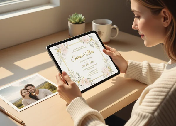
Pair the photo with a specific text prompt
After choosing the image, describe the event clearly. Include the mood, audience, event type, and any color or tone cues that should work with the uploaded photo.
This is where a photo-based invitation workflow becomes more effective. The tool already gives users a place to combine a text description with the uploaded image, so the image should support the prompt instead of doing all the work alone.
A stronger prompt sounds more like a brief than a wish. "Elegant garden wedding invitation with a soft floral mood" gives the image somewhere to go. "Make it pretty" does not.
Review the first draft before sharing it
Do one review pass before sending the result to guests, family, or coworkers. Check whether the text is readable, whether the photo still feels intentional, and whether the mood matches the event.
That is also the moment to ask whether a second upload would help. Sometimes the first photo is fine, but a tighter crop or cleaner PNG version would make the next result much stronger. An invitation design tool is most useful when users treat the first draft as a direction, not as the final answer by default.
What to do next after your first photo-based invite
If the first draft feels close, keep refining the inputs instead of restarting the whole idea. A better crop, a cleaner background, or a more specific description often does more than a full concept change.
If the draft still feels off, go back to the image job. Should the upload be the star of the invitation, or should it act as a supporting element? That one question usually reveals whether the next version needs a different crop, a different format, or no uploaded photo at all.
FAQ about invitation photo uploads
Is JPEG or PNG better for invitation photos?
JPEG is usually the better fit for full photographs. PNG is often the better fit when transparency, cleaner edges, or more precise graphic treatment matters.
Do all invitations need an uploaded photo?
No. Some invitations work better with text-led design, especially when the event tone is formal or the message itself should take center stage.
How much cleanup should you do before uploading?
Do enough cleanup to make the subject clear, reduce clutter, and match the event mood. In most cases, a quick crop and brightness check are enough to improve the first draft.